The last project we had to work on involved to re-design an existent web page from a well known company, in order to practice and reassure what we had learned in class.
The company of my choice was Swedish Hasbeens, they are a company who handmade high quality and sustainable wood shoes better known as clogs.
![]()
They are inspired in the original 70’s design. Their ambition is to continue to release more fun and incoherent shoes and other things inspired by the original design without losing the objective of the brand.
Here is a peek of the process I had to go through:
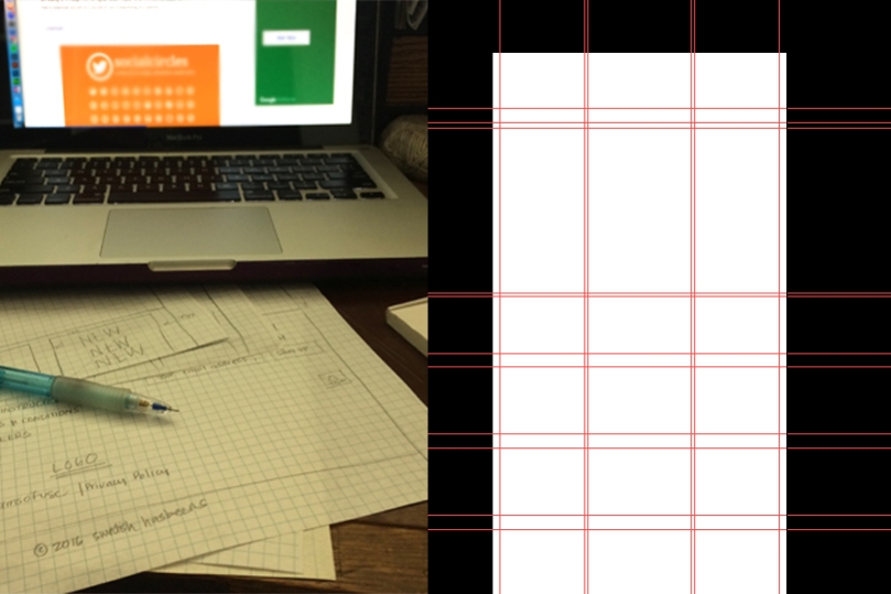
After paying attention to the original website and trying to figure out what Anita was looking for [read the story] was time to work on my own. I did start drafting what I wanted to include in my design, not only visually but also all the web content that I thought it would be interesting as a customer to have on the first view. After this I surf the internet to gather imagery and other tools that could be useful, like fonts and icons. This is where the fun starts, building a layout…
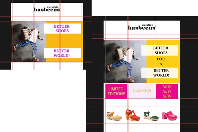
My biggest challenge was to work with color, I tried to stay true to the branding’s company as much as I could. Swedish Hasbeens is about being bold and fun and I didn’t want to get lost there. After some suggestion from the professor I used some of the Color combination tools like this one available for free on the internet.
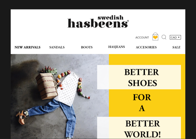
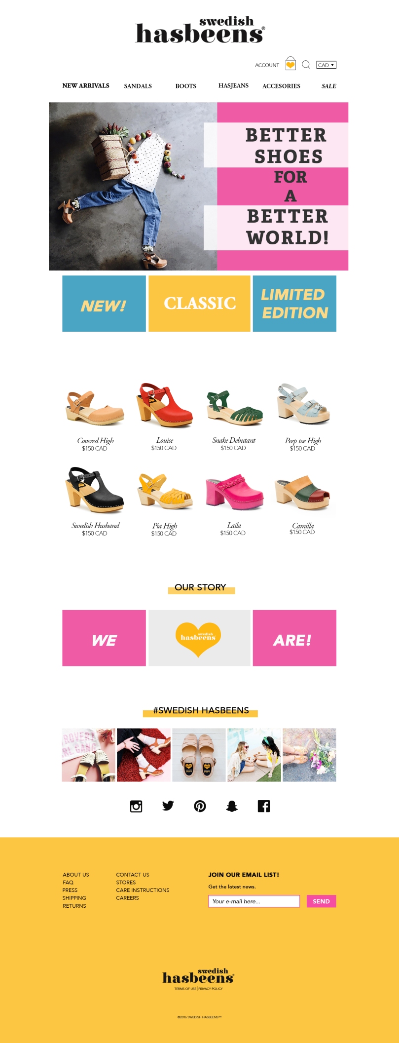
And this is how my final project looks like!
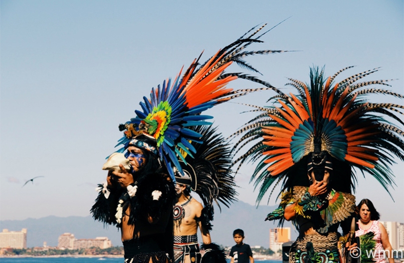
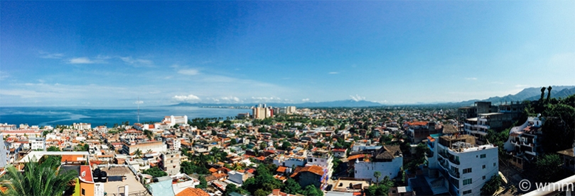
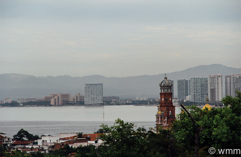
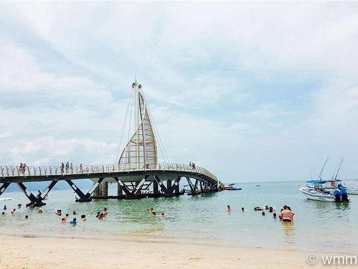
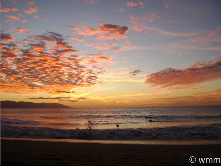
 11th International Fireworks symposium. Puerto Vallarta, Mexico. 2009.
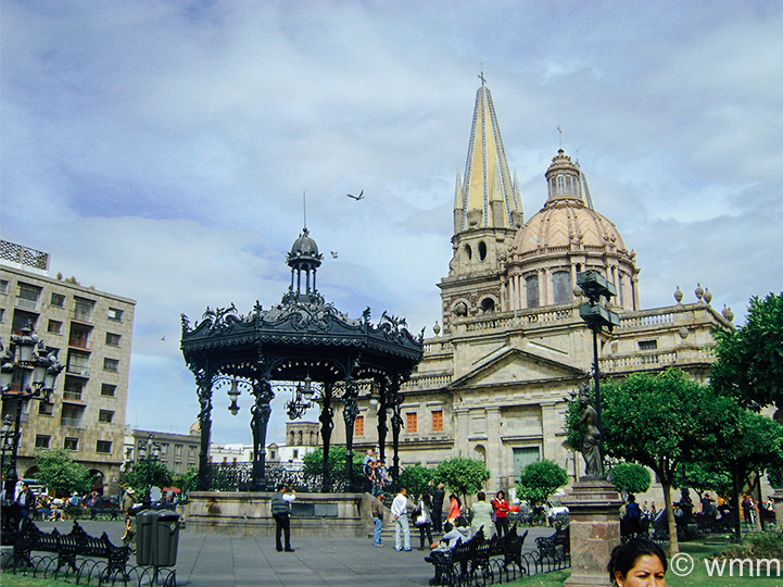
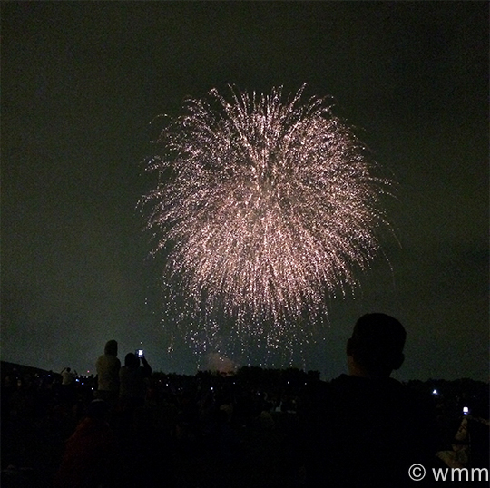 Canada Day. Downsview park. 2014